CloudScore by ExitAnt📘 CloudScore by ExitAnt
CloudScore by ExitAnt 는 일목균형표(Ichimoku Cloud)의 구름대 돌파 신호를 기반으로,
다양한 추세 보조지표를 결합하여 매수 추세 강도를 점수화(0~5점) 해주는 트렌드 분석 지표입니다.
기존 일목구름 단독 신호는 변동성이 크거나 신뢰도가 낮을 수 있기 때문에,
이 지표는 여러 기술적 요소를 종합적으로 평가하여
“지금이 얼마나 강력한 추세 전환 구간인가?” 를 직관적으로 보여줍니다.
🎯 지표 목적
일목균형표 구름 돌파의 신뢰도 강화
보조지표 신호를 자동으로 점수화하여 한눈에 판단 가능
캔들 위에 이모지를 배치해 시각적으로 즉시 해석 가능
초보자부터 숙련자까지 모두 활용 가능한 추세 진입 필터링 도구
🧠 점수 계산 방식 (0~5점)
구름 상향 돌파가 발생하면 아래 조건들을 체크하여 점수를 부여합니다.
▶ +1점 조건 항목
1. 골든 크로스 발생
* 최근 설정한 n봉 이내에서 Fast MA가 Slow MA를 상향 돌파한 경우
2. RSI 과매도 구간
* RSI가 설정 값 이하일 때 추세 전환 가능성이 증가
3. MACD 강세 전환
* MACD가 0 아래에 있으면서 시그널선 상향 돌파 발생
4. RSI 상승 다이버전스
* 가격은 낮아지지만 RSI는 상승 → 바닥 신호
5. 200MA 위에 위치
* 장기 추세와 일치하는 시점만 점수 강화
▶ 점수별 이모지
1점 🟡 : 약한 진입 신호
2점 🟢 : 관찰이 필요한 강화 신호
3점 📈 : 추세 전환 가능성 증가
4점 🚀 : 강한 추세 신호
5점 👑 : 매우 강력한 진입 시그널
🖥 차트 표시 요소
구름대(Span A / Span B)만 표시하여 더 깔끔한 시각화
이모지는 캔들 위에 자동 배치
필요 시 최근 n개의 캔들만 표시하도록 설정 가능
오른쪽 상단에 조건 요약 안내창 표시
🔧 사용자 설정
Tenkan / Kijun / SenkouB 기간 조정
MA, RSI, MACD, 다이버전스 사용 여부 선택
최근 몇 개의 캔들까지 점수를 표시할지 설정 가능
이모지는 사용자 취향에 따라 변경 가능
⚠️ 유의사항
본 지표는 **가격 움직임의 확률적 해석을 돕는 보조지표**이며, 단독으로 매수·매도 결정을 내려서는 안 됩니다.
시장 상황(변동성, 거래량, 프레임)에 따라 신호의 신뢰도는 달라질 수 있습니다.
실제 매매 전략에 적용하기 전 반드시 백테스트와 검증이 필요합니다.
# **📘 CloudScore by ExitAnt — English Description**
📘 CloudScore by ExitAnt
CloudScore by ExitAnt is a trend analysis indicator that evaluates bullish trend strength by scoring (0–5 points) signals based on Ichimoku Cloud breakouts combined with multiple momentum and trend indicators.
Since the default Ichimoku Cloud breakout alone can be unreliable or highly volatile, this indicator integrates several technical conditions to visually and intuitively show
“How strong is the current trend reversal opportunity?”
🎯 Purpose of the Indicator
Enhance the reliability of Ichimoku Cloud breakout signals
Automatically score multiple signals for quick visual judgment
Place emojis directly above candles for instant interpretation
Works for both beginners and experienced traders as a trend-entry filtering tool
🧠 Scoring Logic (0–5 points)
When a bullish breakout above the cloud occurs, the indicator checks the following conditions and assigns points.
▶ +1 Point Conditions
1. Golden Cross
* Fast MA crosses above Slow MA within the user-defined lookback window
2. RSI Oversold
* RSI below threshold increases the probability of trend reversal
3. MACD Bullish Shift
* MACD is below zero while crossing above the signal line
4. RSI Bullish Divergence
* Price makes a lower low while RSI makes a higher low → potential bottom signal
5. Above the 200MA
* Only scores when price aligns with long-term trend direction
▶ Emoji by Score
1 Point 🟡 : Weak early signal
2 Points 🟢 : Improved setup; watch closely
3 Points 📈 : Decent trend reversal possibility
4 Points 🚀 : Strong trend entry signal
5 Points 👑 : Very strong bullish signal
🖥 Chart Elements
Displays only Span A / Span B to keep the cloud visually clean
Emojis automatically appear above candles
Optionally limit the number of candles displaying signals
Summary box appears in the upper-right corner
🔧 User Settings
Adjustable Tenkan / Kijun / Senkou B periods
Enable/disable MA, RSI, MACD, divergence filters
Set how many recent candles should show the score
Emojis can be customized by the user
⚠️ Disclaimer
This is a technical assistant tool that helps interpret price movement probabilities; it should not be used as a standalone buy/sell signal.
Signal reliability may vary depending on volatility, volume, and timeframe.
Always conduct backtesting and validation before using it in real trading strategies.
Pesquisar nos scripts por "ma cross"

元宝均线趋势指标Yuanbao Moving Average Trend Indicator (元宝均线趋势指标)
A powerful, trend-following indicator designed to simplify market dynamics while capturing reliable trend signals—named for its "gold ingot" (Yuanbao) inspiration, symbolizing stability, precision, and wealth accumulation in trading. Built on optimized moving average (MA) logic, this tool filters noise, identifies trend direction, and highlights potential entry/exit zones, making it suitable for forex, stocks, cryptocurrencies, and commodities across all timeframes (from 1-minute scalping to daily swing trading).
Core Logic & Features
1. Multi-Layered MA Architecture
Combines short-term, medium-term, and long-term moving averages (customizable lengths) to balance responsiveness and reliability:
Short MA (e.g., 20-period): Tracks recent price momentum for timely signals.
Medium MA (e.g., 50-period): Confirms trend strength and filters false breakouts.
Long MA (e.g., 200-period): Acts as a dynamic support/resistance level and identifies major trend direction.
All MA types (SMA, EMA, WMA) are selectable—tailor to your trading style (EMA for faster reactions, SMA for smoother trends).
2. Trend Direction Visualization
Intuitive color-coding and line styling eliminate guesswork:
Bullish Trend: Short MA above Medium MA, and Medium MA above Long MA—lines turn green (customizable) to signal upward momentum.
Bearish Trend: Short MA below Medium MA, and Medium MA below Long MA—lines turn red (customizable) to indicate downward pressure.
Sideways/Consolidation: MAs cluster closely (with a built-in "range filter" to reduce noise)—lines turn blue (customizable) to alert neutral market conditions.
3. Dynamic Support/Resistance Zones
The indicator automatically highlights key levels based on MA crossovers and price interactions:
When price pulls back to the Medium/Long MA in a bullish trend: The MA line thickens to mark a potential "support zone" for long entries.
When price rallies to the Medium/Long MA in a bearish trend: The MA line thickens to mark a potential "resistance zone" for short entries.
Breaks above/below clustered MAs trigger "trend reversal alerts" (optional pop-up/alert conditions).
4. Customization for All Traders
Flexible parameters to adapt to any asset or strategy:
Adjust MA periods (short/medium/long) for different volatility levels (e.g., shorter periods for crypto, longer for blue-chip stocks).
Toggle MA type (SMA/EMA/WMA) to match your analysis style.
Customize color schemes, line thickness, and alert conditions (crossovers, trend shifts, price touches).
Enable/disable "noise reduction mode" (smoothes price data to filter choppy markets).
How to Use
Entry Signals
Long Entry:
Bullish trend confirmed (green MA stack: Short > Medium > Long).
Price pulls back to Medium MA (or Long MA for stronger trends) and bounces.
Optional: Confirm with volume or a candlestick pattern (e.g., hammer, bullish engulfing).
Short Entry:
Bearish trend confirmed (red MA stack: Short < Medium < Long).
Price rallies to Medium MA (or Long MA for stronger trends) and rejects.
Optional: Confirm with volume or a candlestick pattern (e.g., shooting star, bearish engulfing).
Exit Signals
Take Profit: Target next resistance/support level, or trail stop using the Short MA (exit if price crosses below Short MA in a bullish trend).
Stop Loss: Place below the Long MA (bullish trades) or above the Long MA (bearish trades) to limit downside.
Trend Reversal: Exit if the MA stack flips color (e.g., green → red for long trades).
Why Choose Yuanbao MA Trend Indicator?
Simplicity: No complex calculations—clear visual cues for trend direction and key levels.
Versatility: Works on all assets (forex, BTC, stocks, oil) and timeframes (1min, 15min, 4h, daily).
Reliability: Multi-MA confirmation reduces false signals, ideal for both beginners and experienced traders.
Customization: Adapt to your trading style, whether you’re a scalper, day trader, or swing trader.
Tips for Optimal Performance
For high-volatility assets (e.g., crypto), use shorter MA periods (e.g., 15/30/100) to stay responsive.
For low-volatility assets (e.g., bonds, blue-chip stocks), use longer MA periods (e.g., 50/100/200) for smoother trends.
Combine with oscillators (e.g., RSI, MACD) to avoid trading against overbought/oversold conditions.
Always test parameters on historical data before live trading—adjust based on asset-specific volatility.

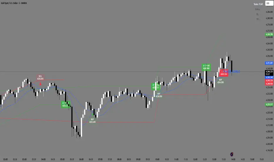
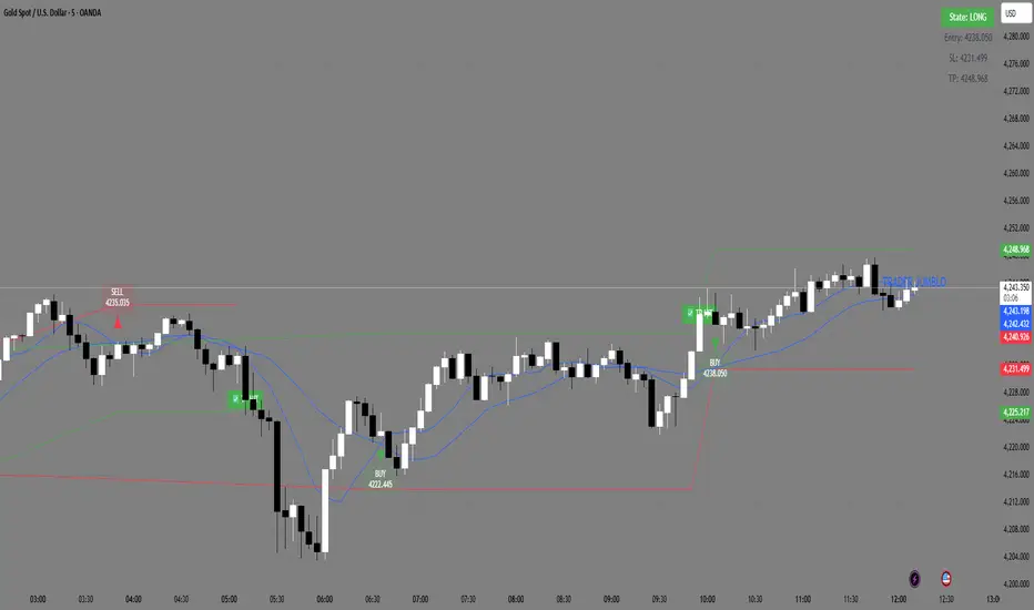
Trader Jumblo Auto Signal V6Trader Jumblo Auto Signal V6 is an advanced crossover-based signal system designed to generate persistent BUY and SELL entries with dynamic ATR-based Take Profit (TP) and Stop Loss (SL) levels.It provides clean, non-repainting trade signals that remain visible on the chart even after price movement — ensuring clarity during both backtesting and live trading sessions.
⚙️ How It Works
🟦 Two Blue Lines — These are your moving averages (Fast and Slow).
The crossover between them determines the signal direction.
When the Fast MA (light blue) crosses above the Slow MA → a BUY signal appears.
When the Fast MA crosses below the Slow MA → a SELL signal appears.
You can choose between SMA or EMA and adjust the lengths in the settings.
🟢 Green Line — The Take Profit (TP) level, calculated using ATR × TP multiplier.
It shows the projected target area for profit when a trade is active.
🔴 Red Line — The Stop Loss (SL) level, also based on ATR × SL multiplier.
It marks the risk boundary for each signal.
✅ When price reaches the green line, “TP HIT” appears.
❌ When price hits the red line, “SL HIT” appears.
These markers persist so you can analyze trade outcomes clearly.
📈 Main Features
Dynamic ATR-based TP and SL levels (auto-adjust with volatility)
Persistent entry, TP, and SL labels (no vanishing signals)
Optional RSI filter for signal confirmation
Instant alert system for BUY/SELL/TP/SL or combined events
Lightweight and optimized for any timeframe
⚡ Best Use
Ideal for swing and intraday traders who want visual clarity and structured risk/reward zones. Works effectively on Gold, Forex, crypto, indices, and stocks
12/21 x 50-100-200 MA - [RZ]👁️ - 12/21 x 50-100-200 MA
A comprehensive moving average overlay indicator designed to identify trend direction and key support/resistance levels using a dual fast/slow MA crossover system combined with three major moving averages.
⛓️ - FEATURES
Dual MA Crossover System: Configurable short (default 12) and long (default 21) period moving averages that change color based on trend direction
Triple Major MAs: 50, 100, and 200 period moving averages displayed in blue, yellow, and red respectively for identifying key market structure levels
Multiple MA Types: Choose from SMA, EMA, DEMA, TEMA, LSMA, WMA, or HMA for all calculations
Customizable Source: Apply the indicator to any price source (close, open, high, low)
Optional Bar Coloring: Visualize trend direction directly on price bars
Built-in Alerts: Automated alerts for trend reversals (Trend Up/Trend Down)
🎮 - HOW TO USE
Bullish Signal: When the short MA crosses above the long MA, both MAs turn green
Bearish Signal: When the short MA crosses below the long MA, both MAs turn red
The 50/100/200 MAs serve as dynamic support/resistance levels and help confirm overall market trend
Use bar coloring for quick visual identification of current trend state
🧰 - OPTIONS
Adjustable lengths for all moving averages
Color customization for bullish/bearish trends
Toggle bar coloring on/off
Select preferred MA calculation method
⚠️ - DISCLAIMER
This indicator is provided for educational and informational purposes only and should not be considered financial advice.
Trading and investing in financial markets involves substantial risk of loss and is not suitable for every investor.
Past performance is not indicative of future results.
The signals and information generated by this indicator do not guarantee profits and may result in losses.
Users should conduct their own research and due diligence, and consult with a qualified financial advisor before making any investment decisions.
The creator of this indicator assumes no responsibility for any financial losses incurred through the use of this tool.
By using this indicator, you acknowledge that you are solely responsible for your trading decisions and their outcomes.
👑 - CREDITS
@profmichaelg for Michael's EMA indicator

9/20/50/200 MAs + VWAP (with 9-20 Fill)Indicator Description: 9/20/50/200 MAs + VWAP (with 9-20 Fill)
The 9/20/50/200 MAs + VWAP indicator is a comprehensive technical analysis tool that combines multiple moving averages and the VWAP (Volume Weighted Average Price) to help traders identify trends, potential support/resistance levels, and momentum shifts. Additionally, it includes a dynamic fill between the 9-period and 20-period MAs to highlight bullish or bearish short-term crossovers.
Key Features:
Multiple Moving Averages:
9 MA – short-term trend indicator.
20 MA – intermediate-term trend.
50 MA – medium-term trend.
200 MA – long-term trend; dynamically colored green/red based on slope.
All MAs can be configured as SMA, EMA, or WMA with customizable colors and thickness.
VWAP (Volume Weighted Average Price):
Shows the average price weighted by volume for intraday trading.
Useful for identifying the true average price and potential support/resistance levels.
9-20 MA Fill Zone:
The area between the 9 MA and 20 MA is filled dynamically:
Green fill indicates 9 MA > 20 MA (bullish short-term momentum).
Red fill indicates 9 MA < 20 MA (bearish short-term momentum).
Fill transparency and color are fully customizable.
MA Labels on Last Candle:
Displays the names of MAs directly on the chart near their current values for easy reference.
ATR Table (Optional):
Shows 5-minute ATR, Daily ATR, ATR % (Daily), and Total Daily Volume.
Provides volatility insights to support risk management.
Use Cases:
Identify short-term and long-term trends using MA slopes.
Spot bullish/bearish momentum shifts with 9-20 MA crossover fills.
Use VWAP and ATR metrics for intraday trading and risk management.
Track total traded volume and session price levels for volume analysis.

3MA/EMA Alerts指标名称(中文/英文)
中文名:多均线趋势指标(带上穿与金叉提醒)
英文名:Multi MA/EMA Trend Indicator (with Price & Golden Cross Alerts)
指标功能介绍(中文)
多均线趋势指标(带上穿与金叉提醒) 是一个可自定义的均线工具,适用于趋势分析和交易信号提醒。
核心功能:
多均线显示
默认显示 EMA20,EMA80/200 可选择显示
每条均线可独立选择 EMA 或 SMA
自定义颜色和线宽
价格上穿均线提醒
当价格向上突破任意开启的均线时触发提醒
可用于捕捉短线趋势启动点
金叉提醒
当短期均线向上穿过中长期均线时触发提醒
可用于捕捉潜在的趋势反转或加速
中文 UI
参数和提醒信息均为中文,便于快速理解和使用
适用场景
趋势确认
趋势反转捕捉
短线入场和长期持仓参考
Indicator Description (English)
Multi MA/EMA Trend Indicator (with Price & Golden Cross Alerts) is a customizable moving average tool for trend analysis and trading alerts.
Key Features:
Multiple Moving Averages
Default display: EMA20; EMA80/200 optional
Each MA can be set as EMA or SMA individually
Customizable colors and line widths
Price Cross Alerts
Alerts when price crosses above any active MA
Helps identify short-term trend initiation points
Golden Cross Alerts
Alerts when a short-term MA crosses above a mid/long-term MA
Useful for detecting trend acceleration or reversal signals
User-Friendly Interface
Parameters and alerts are labeled in Chinese (can be translated)
Applications
Trend confirmation
Trend reversal detection
Short-term entries and long-term position guidance

Market Bias [Mario]Indicator Description: Market Bias
Core Objective and Philosophy
The Market Bias indicator is designed not as a simple signal generator, but as a comprehensive tool for trend analysis and directional bias assessment. Its primary purpose is to provide traders with a clear, at-a-glance understanding of the market's direction across multiple timeframes. By visualizing the alignment of trends, it helps traders make more informed decisions, ensuring they are trading in harmony with the broader market momentum rather than against it. This is a tool for strategic positioning, not for providing blind buy or sell commands.
How It Works: The Core Mechanic
The indicator's logic is based on the relationship between two configurable moving averages (MAs): a Fast MA (defaulting to a 9-period EMA) and a Slow MA (defaulting to a 21-period SMA). The market bias on any given timeframe is determined as follows:
Bullish Bias: When the Fast MA is trading above the Slow MA, it indicates positive, upward momentum.
Bearish Bias: When the Fast MA is trading below the Slow MA, it indicates negative, downward momentum.
Users have full control to customize the type (SMA, EMA, WMA, etc.) and length of each moving average to fit their specific trading style and the asset being analyzed.
Key Feature: The Higher Timeframe (HTF) Bias Table
This is the most powerful feature of the indicator and its main reason for existence. It displays a simple, color-coded table in the corner of the chart, showing the real-time bias for the Daily (D), 4-Hour (4H), and 1-Hour (1H) timeframes.
Purpose: The HTF table solves a critical problem for traders: losing sight of the bigger picture. A trader on a 15-minute chart might see a setup to go long, but if the 4H and Daily charts are strongly bearish, that trade is fighting a powerful current and has a lower probability of success.
Application: By checking this table, a trader can instantly verify if their intended trade direction is aligned with the higher timeframe trends. The ideal scenario is "confluence," where the bias is the same across all key timeframes (e.g., D, 4H, and 1H are all Bullish), giving the trader a strong conviction to only look for long entries.
On-Chart Visual Aids
To support the analysis on the current chart, the indicator provides several visual aids:
Moving Average Plots: Both the Fast and Slow MAs are drawn directly on the chart, allowing traders to see their interaction with price in real-time.
Color-Coded Bars: To make the current trend immediately obvious, the chart's price bars can be colored. Green bars signify a bullish bias (Fast > Slow), while red bars signify a bearish bias (Fast < Slow).
Crossover Markers (Optional): While the indicator is not a signal provider, it can optionally display "Buy" (up arrow) and "Sell" (down arrow) markers when the MAs cross. These should not be interpreted as direct trade signals. Instead, they serve as alerts that the market momentum may be shifting on the current timeframe. They are best used as points of interest or for confirming a thesis that is already supported by the HTF bias.
Summary
In essence, the Market Bias indicator is a decision-support tool. It encourages a disciplined, top-down approach to trading.
Use the HTF Table first to establish your strategic directional bias for the day or week.
Use the on-chart MAs and colored bars to analyze the trend on your preferred trading timeframe.
Use the optional crossover markers only as a final confirmation or timing tool, ensuring they align with the dominant bias established by the higher timeframes.

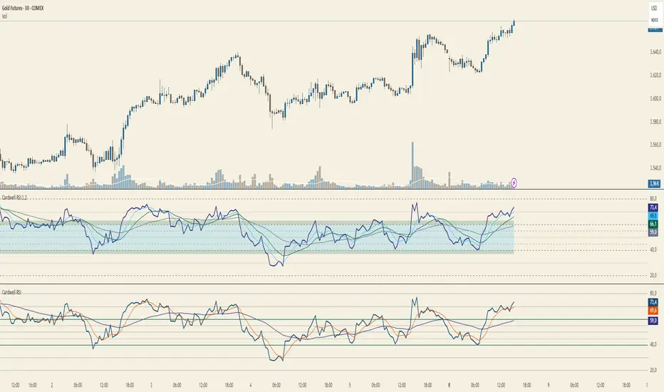
Cardwell RSI by TQ📌 Cardwell RSI – Enhanced Relative Strength Index
This indicator is based on Andrew Cardwell’s RSI methodology , extending the classic RSI with tools to better identify bullish/bearish ranges and trend dynamics.
In uptrends, RSI tends to hold between 40–80 (Cardwell bullish range).
In downtrends, RSI tends to stay between 20–60 (Cardwell bearish range).
Key Features :
Standard RSI with configurable length & source
Fast (9) & Slow (45) RSI Moving Averages (toggleable)
Cardwell Core Levels (80 / 60 / 40 / 20) – enabled by default
Base Bands (70 / 50 / 30) in dotted style
Optional custom levels (up to 3)
Alerts for MA crosses and level crosses
Data Window metrics: RSI vs Fast/Slow MA differences
How to Use :
Monitor RSI behavior inside Cardwell’s bullish (40–80) and bearish (20–60) ranges
Watch RSI crossovers with Fast (9) and Slow (45) MAs to confirm momentum or trend shifts
Use levels and alerts as confluence with your trading strategy
Default Settings :
RSI Length: 14
MA Type: WMA
Fast MA: 9 (hidden by default)
Slow MA: 45 (hidden by default)
Cardwell Levels (80/60/40/20): ON
Base Bands (70/50/30): ON
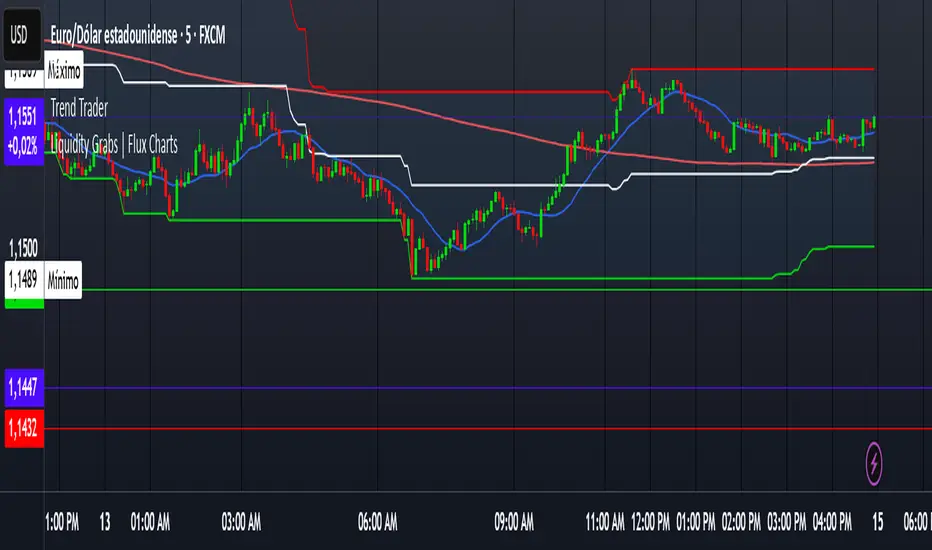
Trend TraderDescription and Usage of the "Trend Trader" Indicator
The "Trend Trader" indicator, created by Gerardo Mercado as a legacy project, is a versatile trading tool designed to identify potential buy and sell signals across various instruments. While it provides predefined settings for popular instruments like US30, NDX100, GER40, and GOLD, it can be seamlessly adapted to any market, including forex pairs like EUR/USD. The indicator combines moving averages, time-based filters, and MACD confirmation to enhance decision-making for traders.
How It Works
Custom Moving Averages (MAs):
The indicator uses two moving averages:
Short MA: A faster-moving average (default: 10 periods).
Long MA: A slower-moving average (default: 100 periods).
Buy signals are generated when the Short MA crosses above the Long MA.
Sell signals are triggered when the Short MA crosses below the Long MA.
Time-Based Signals:
The user can define specific trading session times (start and end in UTC) to focus on high-activity periods for their chosen market.
Signals and background coloring are only active during the allowed session times.
MACD Confirmation:
A MACD (Moving Average Convergence Divergence) calculation on a 15-minute timeframe ensures stronger confirmation for signals.
Buy signals require the MACD line to be above the signal line.
Sell signals require the MACD line to be at or below the signal line.
Target Levels:
Predefined profit targets are dynamically set based on the selected trading instrument.
While it includes settings for US30, NDX100, GER40, and GOLD, the target levels can be adjusted to fit the volatility and structure of any asset, including forex pairs like EUR/USD.
Target 1 and Target 2 levels display when these thresholds are met after an entry signal.
Adaptability to Any Market:
Although predefined options are included for specific instruments, the indicator's moving averages, time settings, and MACD logic are applicable to any tradable asset, making it suitable for forex, commodities, indices, and more.
Visual Alerts:
Labels appear on the chart to highlight "BUY" and "SELL" signals at crossover points.
Additional labels indicate when price movements reach the predefined target levels.
Bar and background coloring visually represent active signals and MACD alignment.
Purpose
The indicator aims to simplify trend-following and momentum-based trading strategies. By integrating moving averages, MACD, customizable time sessions, and dynamic targets, it offers clear entry and exit points while being adaptable to the needs of individual traders across diverse markets.
How to Use
Setup:
Add the indicator to your TradingView chart.
Configure the moving average periods, trading session times, and target levels according to your preferences.
Select the instrument for predefined target settings or customize them to fit the asset you’re trading (e.g., EUR/USD or other forex pairs).
Interpreting Signals:
Buy Signal: The Short MA crosses above the Long MA, MACD confirms the upward trend, and the session is active.
Sell Signal: The Short MA crosses below the Long MA, MACD confirms the downward trend, and the session is active.
Adapt for Any Instrument:
Adjust the predefined target levels to match the volatility and trading style for your chosen asset.
For forex pairs like EUR/USD, consider typical pip movements to set appropriate profit targets.
Targets:
Use the provided target labels (e.g., 50 or 100 points) or customize them to reflect realistic profit goals based on the asset’s volatility.
Visual Aids:
Pay attention to the background color:
Greenish: Indicates a bullish trend during the allowed session.
Redish: Indicates a bearish trend during the allowed session.
Use the "BUY" and "SELL" labels for actionable insights.
This indicator is a flexible and powerful tool, suitable for traders across all markets. Its adaptability ensures that it can enhance your strategy, whether you’re trading forex, commodities, indices, or other assets. By offering actionable alerts and customizable settings, the "Trend Trader" serves as a valuable addition to any trader’s toolkit. FX:EURUSD
NonLag MAThe Non-Lag Moving Average (MA) is a technical analysis indicator designed to track price trends with significantly less lag than traditional moving averages like the SMA or EMA.
Its primary purpose is to provide a smoother, more responsive representation of the current price direction. It achieves this by using a complex, adaptive filtering algorithm—often involving trigonometric functions (like the cosine function in the code you provided)—to assign weights to past price data. This sophisticated calculation allows it to stay closer to the price action, aiming to give earlier and more reliable trend signals.
Traders use the Non-Lag MA to:
Identify Trend Direction : The slope and color of the indicator line clearly signal whether the market is in an uptrend (rising) or a downtrend (falling).
Generate Crossover Signals : Like other moving averages, a faster Non-Lag MA crossing above a slower one can indicate a buy signal, while a cross below can signal a sell.
---
Just another publicly available indicator from MT5 translated.

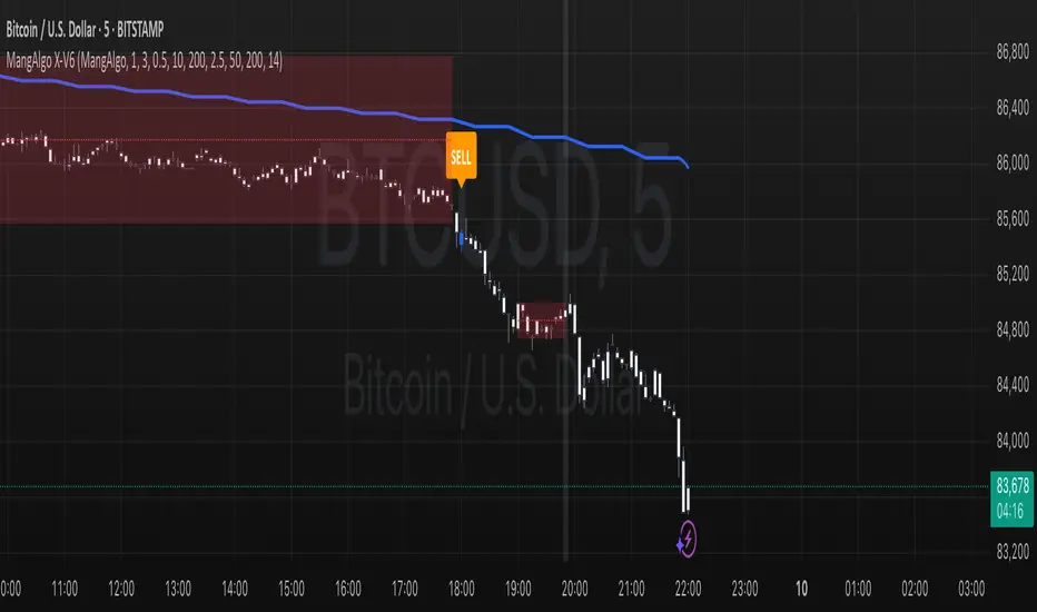
MangAlgo X-V61. Overview & Purpose
The MangAlgo X-V6 script is a multi-component indicator designed to generate buy and sell signals on TradingView charts by combining several technical analysis techniques. It is tailored for various trading styles – including Scalping, Day Trading, and the custom MangAlgo approach – by automatically adjusting parameters based on the selected preset. The primary goal of the script is to deliver more accurate signals by integrating additional filters and a robust trade management system.
⸻
2. Key Features
• Trading Style Presets
• Three preset options: Scalping, Day Trading, and MangAlgo.
• The selected preset automatically adjusts key parameters such as Moving Average (MA) lengths, additional MA filters, and other settings to suit the trading style.
• SL/TP Settings (Stop Loss / Take Profit)
• Adjustable ATR multiplier for calculating the stop loss (SL).
• Multi-level TP (up to 5 levels) based on a configurable risk-reward ratio.
• Multiple Moving Average Types
• Supports various MA types: SMA, EMA, WMA, or VWMA (default is based on conditions).
• Two sets of MAs:
• Fast and Slow MAs for detecting crossovers as primary signals.
• Additional MA Filters (three additional MAs) used as further confirmation.
• Higher Timeframe Filter (HTF)
• Incorporates a moving average from a higher timeframe to provide broader trend context.
• The HTF MA is smoothed using SMA to ensure a stable trend indication.
• SuperTrend Indicator
• Calculates the SuperTrend level using ATR and a configurable multiplier (“Magic Number Factor”).
• Displays a dynamic trend line that changes color: green for an uptrend and red for a downtrend.
• Momentum & Candle Size Filters
• The momentum filter measures price strength using a momentum function over a set period.
• Optional candle size filtering allows you to disregard signals based on minimum and maximum candle sizes to reduce market noise.
• Session Filters
• Optionally filter signals based on trading sessions (New York, London, Tokyo, Sydney) to avoid low-liquidity periods.
• Directional Movement Index (DI)
• Computes DI+ and DI– using a smoothed True Range.
• Acts as an additional filter: a buy signal is valid if DI+ is greater than DI–, and vice versa for sell signals.
• Trade Signal Execution & Management
• Entry Signals:
• Buy: Triggered when the fast MA crosses above the slow MA, supported by SuperTrend, HTF MA, additional MAs, momentum, and DI confirmation (DI+ > DI–).
• Sell: Triggered when the fast MA crosses below the slow MA with corresponding filter confirmations (DI– > DI+).
• SL and TP Setup:
• The stop loss is computed using ATR and adjusted with a trailing SL as take profit levels are reached.
• TP levels (up to 5) are calculated based on the initial risk and a configurable risk-reward ratio.
• Visual Signal & Trade Outcome Display:
• Displays “𝗕𝗨𝗬” and “𝗦𝗘𝗟𝗟” labels on the chart when signals are active.
• Additional labels indicate SL and TP levels and whether the trade outcome was a win or loss once the SL is hit.
• Logging & Trade Statistics (Optional)
• Internal logging records trade details for each confirmed candle, helping you review strategy performance.
• An optional table display shows a summary of trade counts, win/loss results, and win rate percentages.
• Custom Candle Plotting
• Instead of using the standard barcolor(), the script uses plotcandle() to color the candles based on the active trade status:
• Green: Indicates an active buy position.
• Blue: Indicates an active sell position.
• Default colors: When no trade is active.
⸻
3. How It Works & Component Interaction
1. Preset Trading Style Selection:
• Users choose a trading style preset via the input, which sets the values for key parameters such as the type and length of MAs, additional filters, and more.
2. Core Technical Calculations:
• ATR Calculation: Used for range detection and setting the stop loss.
• Moving Averages: Computed through a custom function (f_ma()) based on the chosen MA type.
• Range Detection: The script identifies price ranges by comparing the price to the MA, visualizing the range with boxes and lines.
3. Trend Filtering & Signal Confirmation:
• SuperTrend: Computed using ATR and a multiplier to dynamically generate support/resistance levels.
• Higher Timeframe MA: Provides macro trend context by analyzing a higher timeframe’s data.
• Additional MA & Momentum Filters: Ensure that the price movement is not mere noise, but confirmed by extra layers of filtering.
• DI (Directional Movement): Validates entry signals by ensuring that the directional momentum (DI+) dominates for buys and DI– for sells.
4. Signal Execution & Trade Management:
• When all conditions are met (including session filtering and non-range conditions), a buy or sell signal is activated.
• Upon signal activation, a trade is initiated with a calculated SL and multiple TP levels based on risk parameters.
• As the price reaches a TP level, the script adjusts the stop loss (trailing SL) to lock in gains.
• Trade outcomes (win or lose) are visually labeled on the chart after the SL is hit.
5. Visualization & Logging:
• Trading signals and SL/TP levels are plotted on the chart.
• Custom candle plotting highlights active trades by altering candle colors.
• Trade logging captures detailed information for each candle, which can be used for performance evaluation.
⸻
4. How to Use the Script
• Initial Setup:
• Select your preferred trading style preset (e.g., Scalping, Day Trading, or MangAlgo).
• Adjust additional input parameters if needed, such as the ATR multiplier, number of TPs, or session filters.
• Interpreting Signals:
• Look for “𝗕𝗨𝗬” and “𝗦𝗘𝗟𝗟” labels on the chart as indicators of entry points.
• Use the plotted SL and TP levels as guides for risk management.
• Utilizing Additional Filters:
• Optionally enable the candle size filter and session filters to reduce false signals.
• Regularly monitor the chart and remember that this indicator is a tool that combines multiple technical methods for better signal accuracy.
• Trade Management:
• Use the provided trade outcome labels and logging information to assess and refine your strategy over time.
• If activated, review the trade summary table to analyze overall performance statistics.
⸻
5. Risk Disclaimer
Trading involves significant risk and may not be suitable for all investors.
The MangAlgo X-V6 script is provided for educational and informational purposes only. Past performance is not indicative of future results. Trading decisions based on this script are at the sole discretion of the user, and the creator or distributor of the script is not responsible for any financial losses incurred. Always perform your own analysis, use proper risk management techniques, and consult with a professional financial advisor if necessary.
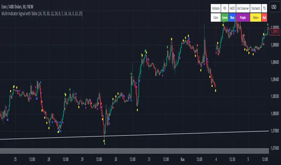
Multi-Indicator Signal with TableThis indicator is a versatile multi-indicator tool designed for traders who want to combine signals from various popular indicators into a single framework. It not only visualizes buy and sell signals but also provides a clear, easy-to-read table that summarizes the included indicators and their respective signal colors.
Key Features:
RSI (Relative Strength Index):
Buy Signal: RSI falls below the oversold level (default: 30).
Sell Signal: RSI rises above the overbought level (default: 70).
Signal Color: Green.
MACD (Moving Average Convergence Divergence):
Buy Signal: MACD line crosses above the signal line.
Sell Signal: MACD line crosses below the signal line.
Signal Color: Blue.
MA Crossover (Moving Average Crossover):
Buy Signal: Short EMA (default: 7) crosses above Long SMA (default: 14).
Sell Signal: Short EMA crosses below Long SMA.
Signal Color: Purple.
Stochastic Oscillator:
Buy Signal: Stochastic %K falls below 20 and crosses above %D.
Sell Signal: Stochastic %K rises above 80 and crosses below %D.
Signal Color: Yellow.
TSI (True Strength Index):
Buy Signal: TSI crosses above the zero line.
Sell Signal: TSI crosses below the zero line.
Signal Color: Red.
Dynamic Signal Table:
A clean, compact table displayed at the top-right corner of the chart, summarizing the indicators and their respective signal colors for quick reference.
Customization:
All indicator parameters are fully adjustable, allowing users to fine-tune settings to match their trading strategy.
Signal colors and table design ensure a visually intuitive experience.
Usage:
This tool is ideal for traders who prefer a multi-indicator approach for generating buy/sell signals.
The combination of different indicators helps to filter out noise and increase the accuracy of trade setups.
Notes:
Signals appear only after the confirmation of the current bar to avoid false triggers.
This indicator is designed for educational purposes and should be used in conjunction with proper risk management strategies.
Detrended Price Oscillator [NexusSignals]Detrended Price Oscillator (DPO) is a detrended price oscillator, used in technical analysis, strips out price trends in an effort to estimate the length of price cycles from peak to peak or trough to trough.
DPO is not a momentum indicator, instead highlights peaks and troughs in price, which are used to estimate buy and sell points in line with the historical cycle. (cf. to investopedia)
DPO indicator made by NexusSignals components :
a filled area that allow users to see easy the trend of an asset;
a sma moving average on chart (default length is 20)
a 20 sma on oscillator, both ma's are color coded to show uptrend / downtrend
a donchian channel applied to the dpo to show breakouts, breakdowns and resistances/support, reversals
few alerts for price crossing above ma, cross above the 0 dpo line, and for cross above and below the donchian channels top and bottom
How you can use DPO indicator ?
The detrended price oscillator (DPO) can be used for measuring the distance between peaks and troughs in the indicator that may help traders to make future decisions as they can locate the most recent trough and determine when the next one may occur in the meassured distance on oscillator between peaks and troughs.
You can use the indicator to find the potential price reversals, for example when the price of an asset is in a bearish trend and the dpo is bouncing from the donchian channel bottom, that may be a potential swing low for that asset, same thing in a bullish trend when the dpo rejecting at top of donchian channel may be a trend reversal, a pullback or swing high.
When DPO is above the 0 trend is in an uptrend and when dpo is below the zero the asset is possible to move into a downtrend.
Also crosses of DPO above and below the DPO moving average may signalising a trend change.

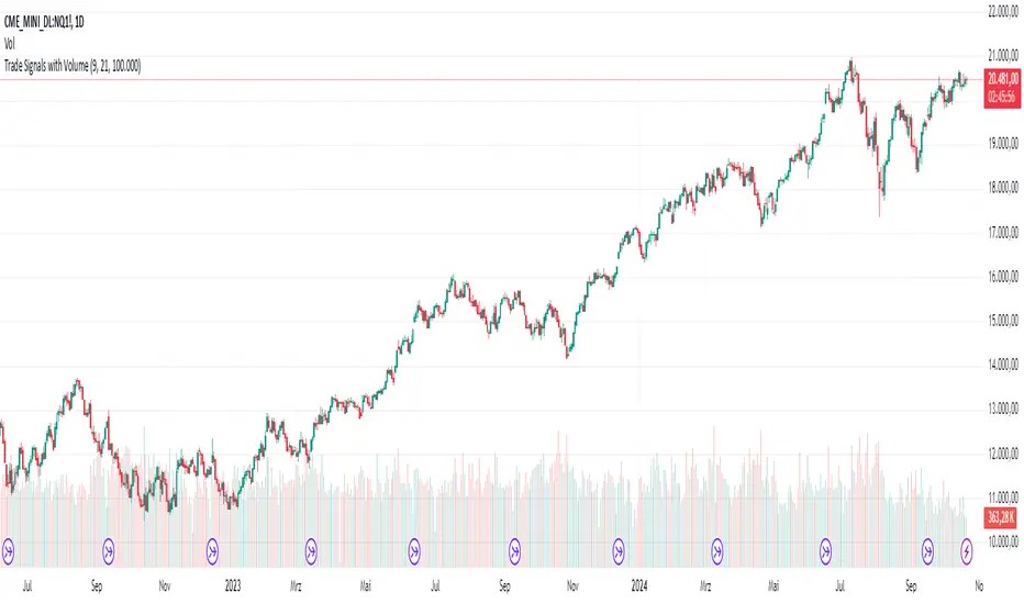
AndreundCristianIndicator Overview:
The "Trade Signals with Volume" indicator is a custom script that generates buy and sell signals based on the crossover of two moving averages (a fast one and a slow one) and adds a volume filter to validate these signals. It plots these signals directly on the chart, using arrows or labels to indicate where buy and sell signals occur.
Key Features:
Moving Averages (MA):
The indicator uses two Simple Moving Averages (SMA): a fast SMA and a slow SMA.
A buy signal is triggered when the fast MA crosses above the slow MA, signaling potential bullish momentum.
A sell signal is triggered when the fast MA crosses below the slow MA, indicating potential bearish momentum.
Volume Filter:
To ensure that signals are more reliable, the indicator only triggers a buy or sell signal if the volume is above a certain threshold. This threshold can be adjusted by the user in the input settings.
For example, if the volume exceeds 100,000 (or any set value), and a crossover occurs, the signal is validated.
Visual Representation:
Buy signals are represented with green labels or arrows below the price bars.
Sell signals are represented with red labels or arrows above the price bars.
The MAs are also plotted on the chart for visual reference.
Input Parameters:
Fast Moving Average Length: The number of periods for the fast SMA (default is 9 periods).
Slow Moving Average Length: The number of periods for the slow SMA (default is 21 periods).
Volume Threshold: The minimum volume required to validate a buy or sell signal (default is 100,000).
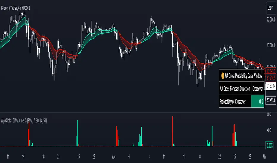
Moving Average Cross Probability [AlgoAlpha]Moving Average Cross Probability 📈✨
The Moving Average Cross Probability by AlgoAlpha calculates the probability of a cross-over or cross-under between the fast and slow values of a user defined Moving Average type before it happens, allowing users to benefit by front running the market.
✨ Key Features:
📊 Probability Histogram: Displays the Probability of MA cross in the form of a histogram.
🔄 Data Table: Displays forecast information for quick analysis.
🎨 Customizable MAs: Choose from various moving averages and customize their length.
🚀 How to Use:
🛠 Add Indicator: Add the indicator to favorites, and customize the settings to suite your trading style.
📊 Analyze Market: Watch the indicator to look for trend shifts early or for trend continuations.
🔔 Set Alerts: Get notified of bullish/bearish points.
✨ How It Works:
The Moving Average Cross Probability Indicator by AlgoAlpha determines the probability by looking at a probable range of values that the price can take in the next bar and finds out what percentage of those possibilities result in the user defined moving average crossing each other. This is done by first using the HMA to predict what the next price value will be, a standard deviation based range is then calculated. The range is divided by the user defined resolution and is split into multiple levels, each of these levels represent a possible value for price in the next bar. These possible predicted values are used to calculate the possible MA values for both the fast and slow MAs that may occur in the next bar and are then compared to see how many of those possible MA results end up crossing each other.
Stay ahead of the market with the Moving Average Cross Probability Indicator AlgoAlpha! 📈💡
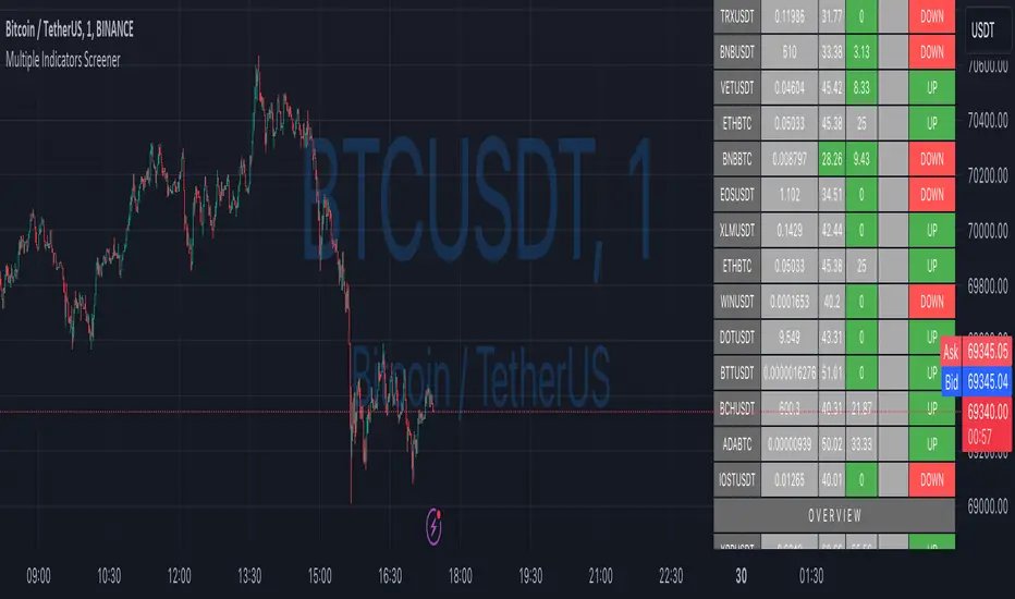
Ultimate Custom MTF ScreenerThis indicator will allow you to make your custom TradingView MTF screener without coding. Add it to the chart, select up to 10 instruments, 4 timeframes, and 4 indicators, and the screener will do the rest for you. The indicator will form a lovely table with all values and highlighted signals.
The screener is highly customizable, and you can choose its position on the chart, sorting, order of the columns, and colors for the tables. You can easily change parameters for all supported indicators and their signals.
Currently, there are 21 different custom indicators available. Current list of indicators:
Average Directional Index (ADX) - displaying the value of ADX and checking if it's higher than the threshold
Average True Range (ATR) - showing the value of ATR
Awesome Oscillator (AO) - displaying the value of AO and highlighting positive/negative values.
Bollinger Bands (BB) - showing if the price is above/below/in the channel.
Breakout Pivots - Displaying when the price is below/above the most recent pivot low/high.
Commodity Channel Index (CCI) - shows the last CCI value and highlights overbought/oversold values.
Directional Movement Index (DMI) - Up/Down signal (+DI above or below -DI)
Donchian Channel (DC) - showing if the price is above/below/in the channel.
Heikin Ashi Count (HAC) - What is the current Heikin Ashi candle color and for how long was this color?
Historical Volatility (HV) - Current value of Historical Volatility
Keltner Channel (KC) -showing if the price is above/below/in the channel.
Moving Average Convergence Divergence (MACD) - Up/Down signal (MACD above / below signal)
Moving Average Crossover (MA Cross) - Displaying MA crosses signals (SMA, EMA, WMA, HMA, VWMA, SMMA, DEMA, VWAP supported)
Moving Average Distance (MA DIST) - Displaying distance to the MA (SMA, EMA, WMA, HMA, VWMA, SMMA, DEMA, VWAP supported)
Parabolic Stop and Reverse (PSAR) - Up or Down
Relative Strength Index (RSI) - Displaying the last RSI value and highlighting overbought/oversold values.
Stochastic (STOCH) - Displaying the last Stochastic value and highlighting overbought/oversold values.
Stochastic RSI (STOCH RSI) - Displaying the last Stochastic RSI value and highlighting overbought/oversold values.
SuperTrend - Current state of the SuperTrend.
Trailing Stop-Loss (TSL) - Up or Down
True Strength Index (TSI) - Displaying the last TSI value and highlighting overbought/oversold values.
We're already working on adding a few more supported indicators. If you have any ideas about the indicators you want to see in our screener, contact us, and we'll consider them.
Disclaimer
Please remember that past performance may not be indicative of future results.
Due to various factors, including changing market conditions, the strategy may no longer perform as well as in historical backtesting.
This post and the script don’t provide any financial advice.

Simple Swing with T3MAThis indicator is based on T3 Moving Average , which was first described in the January 1998 issue of the " Stocks & Commodities " journal in the article " Smoothing Techniques For More Accurate Signals " by Tim Tillson.
The T3 Moving Average was developed in the search for a “perfect” moving average, which would have 2 characterictics:
Smooth (not sensitive to random noise in the underlying price)
Would not lag behind the price
The smoothness of a filter could be improved by running it through itself multiple times, at the cost of increasing the phase lag. So, we choose a moving average with a very minimal lag (Generalized DEMA), & run it through itself multiple times to get a smoother version with with minimal lag (T3 MA). The problem with multiple runs though these filters increase their tendency to overshoot the data, giving an unusable result. To solve this problem, we need to simply turn down the volume by using a volume factor less than 1. Using a value for v less than 1, & running GDEMA (Generalized DEMA) through itself multiple times we get a new, smoother moving average (T3) that does not overshoot the data:
T3(n) = GDEMA(GDEMA (GDEMA(n)))
Traditionally, the entry is mainly done by crossovers between a fast and a slow moving average (MA). When the fast MA crosses up the slow MA, the trader takes it as a buy signal. Similarly, when the fast MA crosses down the slow MA, we get a sell signal. These traditional signals are lagging .
In the Simple Swing Strategy, we propose the Early Upswing (E0) & Early Downswing (Ex) terminologies. The Early Upswing starts when the T3 ribbon is red (i.e. Fast T3MA is lesser than slow T3MA), but the price has closed above the ribbon. This is the E0 candle. Similarly, the Early Downswing starts when the T3 ribbon is green (i.e. Fast T3MA is greater than slow T3MA), but the price has closed below the ribbon. This is the Ex candle.
The long entry (or the short exit) is taken once the price closes above the red ribbon.
The long exit (or the short entry) is taken once the price closes below the green ribbon.
Thereafter, the color of the ribbon confirms the swings. When we have the green ribbon, we are in a Confirmed upswing . When we have the red ribbon, we are in a Confirmed downswing .
p.s. It should be noted that the terms “swing” & “trend” are not interchangable. You can have an upswing in a downtrend, & a downswing in an uptrend. An upswing in an uptrend is the most reliable environment for long positions, & vice versa.
---------------------------------------------------------------
References:
- T3 Average by HPotter (2014)
- T3MA Ribbon by JustUncleL (2017)

Ultimate Custom ScreenerThis indicator will allow you to make your custom TradingView screener without coding. Add it to the chart, select up to 40 symbols and five indicators, and the screener will do the rest for you. The indicator will form a lovely table with all values and highlighted signals.
The screener is highly customizable, and you can choose its position on the chart, sorting, order of the columns, colors for the tables, and all signals separately. You can easily change parameters for all supported indicators and their signals.
Currently, there are 19 different custom indicators available. Current list of indicators:
Average Directional Index (ADX) - displaying the value of ADX and checking if it's higher than the threshold
Average True Range (ATR) - showing the value of ATR
Awesome Oscillator (AO) - displaying the value of AO and highlighting positive/negative values.
Bollinger Bands (BB) - showing if the price is above/below/in the channel.
Breakout Pivots - Displaying when the price is below/above the most recent pivot low/high.
Commodity Channel Index (CCI) - shows the last CCI value and highlights overbought/oversold values.
Directional Movement Index (DMI) - Up/Down signal (+DI above or below -DI)
Donchian Channel (DC) - showing if the price is above/below/in the channel.
Historical Volatility (HV) - Current value of Historical Volatility
Keltner Channel (KC) - showing if the price is above/below/in the channel.
Moving Average Convergence Divergence (MACD) - Up/Down signal (MACD above / below signal)
Moving Average Crossover (MA Cross) - Displaying MA crosses signals (SMA, EMA, WMA, HMA, VWMA, SMMA, DEMA, VWAP supported)
Moving Average Distance (MA DIST) - Displaying distance to the MA (SMA, EMA, WMA, HMA, VWMA, SMMA, DEMA, VWAP supported)
Price - Displaying the last price for the instrument
Relative Strength Index (RSI) - Displaying the last RSI value and highlighting overbought/oversold values.
Stochastic (STOCH) - Displaying the last Stochastic value and highlighting overbought/oversold values.
Stochastic RSI (STOCH RSI) - Displaying the last Stochastic RSI value and highlighting overbought/oversold values.
SuperTrend - Current state of the SuperTrend.
True Strength Index (TSI) - Displaying the last TSI value and highlighting overbought/oversold values.
We're already working on adding a few more supported indicators. If you have any ideas about the indicators you want to see in our screener, contact us, and we'll consider them.
Disclaimer
Please remember that past performance may not be indicative of future results.
Due to various factors, including changing market conditions, the strategy may no longer perform as well as in historical backtesting.
This post and the script don’t provide any financial advice.
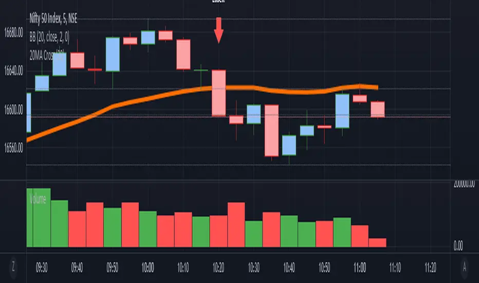
it is a simple Ma cross alert. We can set any ma period.Simple alert for 20MA cross. We can set any ma period.
it plots the crossing candle. This script is purely testing purpose.
KAMIKAMI EMA RIBBONGood evening plebians, This IS Cryptofilio, Your dark knight in the Crypto lightness.... Introducing yet another nebulous indicator... It's the KAMI, KAMI (GODS in Japanese) EMA ribbon.....
This indicator uses 3 primary lengths of EMA labeled as Short, Medium, and Long. They change colors in relation to each other and in relation to the current price of the security.
This indicator is more sophisticated than a simple MA cross strategy as you can use a wider variety of signals for entering earlier and exiting earlier, thus getting into a trade early in the run-up and getting out before the run-down. The EMA is identifiable by the color, lighter green and red representing lower lookbacks. When the OHLC4 crosses the ema it changes color. Thus if all colors are red, then the security is trading below all EMA's - a strong sell or short signal.
GREEN inside of RED indicates an uptrend within a larger downtrend... and of course, the inverse is also true.
The triangles which indicate a cross, are color-coded according to their significance by transparency - the less transparent the more important or significant the cross.
In addition, there are bull and bear bounce indicators (the arrows) that predict a bounce up or down from the security meeting a point along the EMA line and reacting.
VARIATIONS: To use this for scalping I suggest 5,8,13

Two Moving Average CrossChoose two completely different moving averages and determine crossover points. Feel free to copy and paste the code into any strategy using MA crosses in order to optimize backtesting.

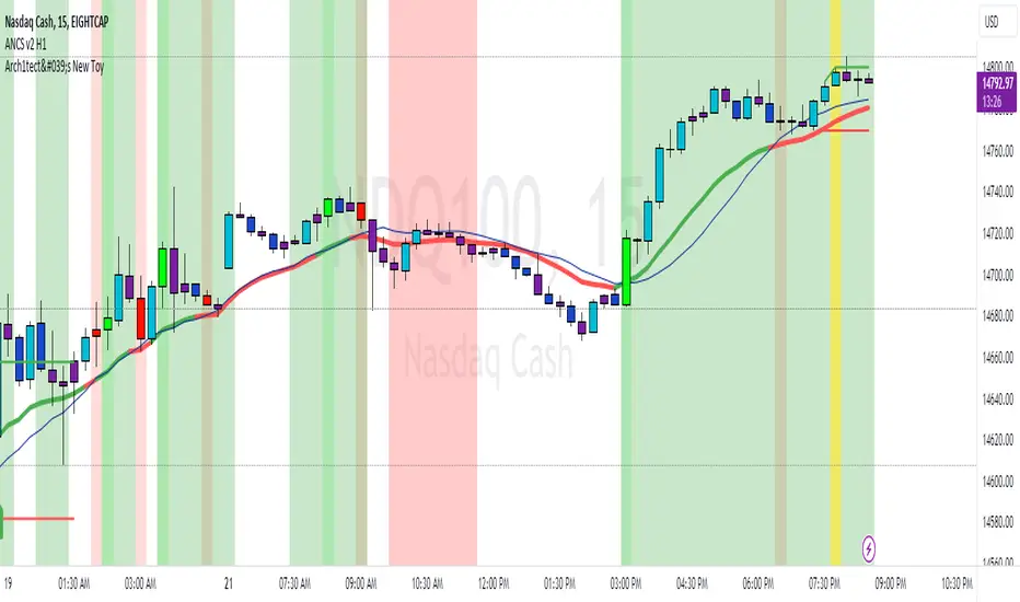
Arch1tect's New ToyDescription:
Arch1tect's New Toy tries to predict market trends by simply utilising 2 moving averages crossovers.
How it works:
Buy signals are triggered when the faster MA crosses over the slower MA from the downside to the upside.
Sell signals are triggered when the faster MA crosses under the slower MA from the upside to the downside.
How to use:
Take buys when buy signal is triggered AND close existing sell position
Take sells when sell signal is triggered AND close existing buy position
Note:
Settings are optimised for XAUUSD on the M1 chart.
Extra:
Alerts are included.
You can toggle between EMA , WMA and SMA to your liking.
Strategy Tester version: